
IceWeb08 conference Transcript
00:07 Thanks everybody, I hope lunch was pretty good. My name is Brian Suda and I work for TM Software and I want to tell you a bit about myself, a bit of background information, to help frame this discussion, because today I am going to be talking about Creating a Specialized Mobile UI. Now, originally I am from the US and I studied and got a degree in Computer Science Software Systems, so my background is very much in programming, Java, C, C++. I moved then to Scotland, I studied Informatics so I've got a lot more background in a lot of crazy interface, HCI, again, more software systems, so I have very much a coding background, but I think as we've seen with a lot of the other speakers when you end-up coming to your job you wear a lot of different hats. It's no different for me either, some days I might be fixing CSS, some days I am doing javascript, some days I'm coding JSP, other days I am designing stuff, and some times I'm doing UI. Today, I am going to talk to you about Mobile UI and this is coming less from an academic stand-point and more from some of the projects we have worked on and some of the things we've come across in our research. So I think also everybody in this crowd, even though you might not be a UI expert or know anything about anything about usability or user-interfaces we are all consumers and we're all customers. So when we know when we hit bad UI, we know when we have a bad experience. So hopefully today, I'm going to give you a few tips and show you a few things about how we can make a better experience and a better user-interface both for regular websites and for mobile as well.
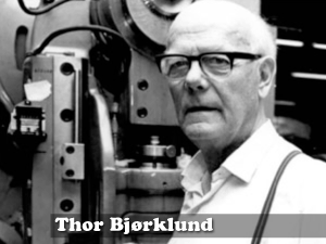
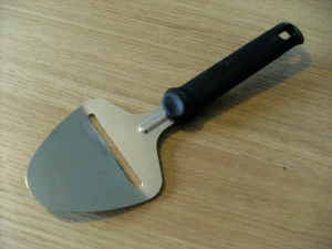
01:46 First, I want to tell you a little story. This is Thor Bjorklund and he lived from the late 1800s to the early 1900s. He's Norwegian and he's a master carpenter and like most Norwegians he used to love his cheese. You can imagine that every day his wife would pack him a little lunch box, he'd go to work he'd be making some furniture, noon would come around and he'd open his little lunch box, have a couple slices of bread and a big block of cheese. So he'd take out his little pocket knife and try and slice off a chunk of cheese, and sometimes he'd get a really thick slice, sometimes you'd get a thin slice, sometimes it cuts in half and doesn't really work. So he looked around and said "well, I work in this workshop all day long. Maybe, I've got some tools I can use instead". And he saw that he had a wood plainer, it is a little thing that you can use slide along and it cuts off nice smooth, even stripes of wood. So he thought to himself, "Maybe I could use this on my block of cheese?". And low-and-behold, in 1925 this man invented the cheese slicer which we all know and use today. This was a revolution in cheese slicing technology, this was cheese slicing 2.0 of the time. It is interesting, because of instead trying to use his pocket knife and forcing and old tool into doing something new, he scraped that and said "This is a new job, something different, we need a new tool for this". So, hopefully I am going to convince you today that this is similar for mobile websites. That we have the same sort of paradigm shifts, were we're going to need new tools, new technologies and new ways to interfacing with mobile devices than we are currently using in desktop sites.

03:30 So I want to talk a little bit about Talking Heads. If we look back at history, we have lots of these sorts of paradigm shifts. Where we've gotten rid of the pocket knife and invented the cheese slicer. July 2nd, 1928, in the US, it was the first time we've had television broadcast. Now previously, before that in the US they had been doing radio for about 10 years. They knew how to do radio really, really well. So when TV came around, they said "Well, what are we going to do?". I think, Icelandic TV was no different, you'd have two people sitting at a table, with a microphone and they'd be talking, just like you do in radio, but this time we put a camera pointed at them. And it's pretty boring if you've ever seen these TV shows and that's why it's called Talking Heads. Literally it's just two people talking to each other. This is the way we used to describe early television. For people who'd never seen a TV, "What is TV? Well it's just like radio, but with pictures". This is good, "I know what a radio is, so I can envision a radio with pictures". As the Internet came along we had the same sort of description. "What is the internet? The internet is just like TV, but only more interactive." It frames the conversation, people know what a TV is, "Ok, I can imagine TV, i can imagine it to be more interactive". Ironically, now with digital television, press the red button, TV is now becoming more like the internet. So it has shifted the other way. So this is good because, it grounds people's understanding, we know what radio is, we know what TV is, so we can apply it to the next paradigm. But it's also bad, because once you start saying "TV is just like radio, but with pictures" you are saying that TV can't be more than just 'radio with pictures'. I think we all understand and all know that TV is so a lot more than just radio with pictures, as many of the other speakers and Kathy was talking about, it taps into other senses, we see pictures of cookies, we start smelling them. We can't do these sorts of things with radio. So one of the big gripes I have about mobile technology and mobile web is that people say "Oh, the web on your phone it's going to be just like the web on your desktop, but on a phone". I don't think that is necessarily true, as we've seen, it's not radio with pictures, so it's not going to be Internet, but on your phone. We need to break out of this, that's my first gripe. I've got a few.
05:55 The next one is, It's all about the lifestyle. The whole term "Mobile Web", I think it's a bad name, for lots of reasons, but the main one, "Mobile Web". I think alot of people hear the word "mobile" and they start thinking of it as a noun - Mobile Device and that's not the case. The word mobile should be "on the move", it should be "The Web on the Move" not the "mobile web". As long as we're continuing to confuse these two things we're never going to be able to move the discussion forward. So I don't like the term "Mobile Web" and I think if there is one thing, at the end of today for everyone who's been here we have to stop using the term "mobile web". That's your homework never to use that term again. But it would be pretty bad of me to tell you that without offering some sort of solution.
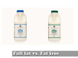
06:44 So one of the things that we go about at our work is to talk more about Full Fat vs. Fat Free. This is an interesting one for lots of reasons, because we compare a regular website, a traditional desktop website to full fat. And we think of more traditional mobile websites as fat free. Sometimes we talk about it as sugar-free or fat free. The idea is that your mobile device should be much more light weight, should be a lot less information than your full-fat website, your traditional website. One of the other really nice side-effects about this is it helps limit feature creap. If you keep calling this a mobile website, some one says "We need to add another navigation item, we need to add something else." Well, sure it fits in your mobile navigation, but is it still fat-free, is it still light-weight, because at the end of the day we really want to focus on the end-user, the end-customer. I've got my iPod touch, and this will do regular full-fat websites, traditional websites. I might be at home, sitting on the couch, watching TV. I've got no problem on that think, loading-up the BBC's full, traditional websites. It's not a problem, I've got WiFi a fast connection, it doesn't bother me. But maybe, if I'm running between airport terminals, because one flight was late, I want to know if i am going to miss that connecting flight. I don't want to look at a full-fat website, I want to be able to look at the very small, fat free version. So it's very much about the situation, and conversely, I might be sitting at my desk at work, getting loads and loads of client calls wanting to know information. The easiest way for me to answer that might be the fat-free website. I can get the information, get in and get out. But if we keep calling it, mobile websites, then it doesn't make a whole lot of sense that I am checking a "mobile website" on my desktop computer. We really need to get past that term "mobile web" and my suggestion and I hopefully everyone will take this away back to work, that we should use the term full-fat and fat-free.
08:57 So we've talked about types of websites, these two kinda major ideas. We need to talk about types of users, because the types of users, types of customers that will come to your fat-free version of your website vary quite a bit and because of that you need to optimize your user-interface and your usability depending on this. Now, Google did a lot of homework a couple of years ago of their user-base we can re-use a lot of their homework and apply them to our projects as well. Google managed to break all their users into three main groups. It was Repetitive now, Bored now and Urgent now. These are the three main categories that any of their users would fall into.
09:44 The first major group is Repetitive Now and what this was, is people would go to your website, look for a tiny little bit of information and leave. So something like vedur.is, you go in you want to see tomorrow's weather, you check the weather, OK - your done. You're not going to convert these people to more page views, you're not going to extend their session time. So when you are thinking about your mobile device and your fat-free site, this is the kind of information that you or your clients have should make it very easy for people to come-in, get the information and get out. You don't want to busy a repetitive task 3 or 4 or 5 levels deep in navigation and clicking. You want to be able to make it right there, in their face, get the info so they can move on with their life.
10:28 Second group is Board now. These are people who are with mobile devices. You go to a cafe, you order a coffee and you are waiting for 5-10 minutes for your friend to arrive. You've got time to kill, you're not really looking for any sort of specific information, you're just looking to be entertained. This is the bored now category. Google has done a really good job of this with YouTube. If you go to YouTube on a mobile device, they simply say, here are the top 10 videos right now. Here are the last 10 videos that have been watched. People don't want to search and they don't want to dig around for information. They don't even know what they want, they just want to be entertained - they're bored. So if this is the kind of information that your company has, you need to play to this and display your user-interface differently.

11:18 The last group is Urgent Now. These are people, like i said earlier, if my plane is running late, I've got to run between terminals, am I going to make my flight? Another one, kinda scenario, is maybe you're at home and the power goes out. If the power goes out you probably don't have your phone line anymore, you don't have your internet connection, your computer might not turn on. The only way you can get in to find a phone number to call the power company might be your mobile device. So you want to get in, it's urgent, I need to get power, maybe the water-main outside has exploded, you need to find the information as quick as possible to fix the situation. When we did our analysis for airlines, we realized that most of their customers fell into two categories. It was either the repetitive now - had the flight landed. I am waiting for my friend, are they here yet? No, I'll check again in 10 minutes. Have they arrived yet? no, not here yet. Or the Urgent now category, "oh my god, I'm running late, am I going to miss my flight?" So taking those two thinking into consideration that's how we worked through and designed our fat-free version.

12:25Yesterday Finnur claimed he was going to talk about cheese, today I actually am talking about cheese. We've talked a little bit about the types of sites and the types of users. So I want to start moving on into some of the more specific UI and some of the things that you can actually do in your site to help improve it.
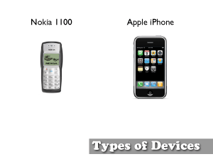
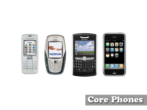
12:50 If you thought developing for 3-4 different types of browsers was difficult as Nate showed us, there's thousands and thousands of potential-both phones and user-agents out there. It's not only the type of device and the screen. On the left we have the Noika, it's pretty ugly, green-screen and on the right we've got the fancy [iPhone] with really high resolution, high DPI. But beyond just the look and feel, you've got on the left just the T9 text input. So you've got 9, 12 little buttons you can press, whereas on the iPhone and Blackberries and others, you've got a full QWERTY keyboard. So it's not just the device, the way it looks, it's also how the user interacts with it. By the end of this year (2008) Apple are expected to sell, or is estimated to sell about 14 million [iPhones].
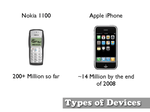
13:46 Nokia has already sold over 200+ million of this particular model of phone. So that means there are approximately 10 or more Nokia 1100s for every 1 iPhone out there. So we might like to think that we want talk and design for the newest hottest craze, but a lot of the time there's a lot of phones in between these two. Nate kind of alluded to previously a lot of progressive enhancement and that's what we try to think about when we're deigning websites
14:13 So one of the best ways we can begin to do progressive enhancement is browser sniffing. Now, a lot of people don't like this idea and there's reasons why. As Nate was saying you don't want to develop one full-fat website which works across all A-grade browsers and then design a thousand fat-free websites for every possible type of mobile device. The maintenance on that would be pretty crazy. So we wanted to do browser sniffing and most people have probably come across browser sniffing, sometimes it is called user-agent detection. They've come across this on their bank. You go to your bank and you try and login and your bank says, "We're sorry, you need to be using Firefox 2 or higher" and you kinda scratch your head and say "Well, I'm using Firefox 3, I thought 3 was higher than 2 isn't it?". A lot of the time people use browser sniffing to prevent you from doing something they check and they say, no you can't, we haven't coded to that. Where browser sniffing should actually be done the other way around. Nate had alluded to with progressive enhancement. You should always have your base-line site that works across that ugly Nokia all the way up to the iPhone. Then you detect what kind of device it is and then begin to layer function on top if that. Some of the functionality you can layer on top - you can check to see, you can get the User-agent string and then look-up in a table and find out capabilities, so you can find out the screen width and maybe you serve-up a slightly different image so you know that it fits the full screen or higher resolution. You can detect to see if it even accepts color images. If it can you serve-up your nice photo if it can't maybe you don't serve a photo you serve some BMP black and white version. Some of the other thing you can detect though are really interesting is the TEL protocol.
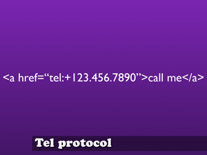
16:00 Now this works very similar to an email link. When you click a mailto link in a regular browser it launches you mail application. With the TEL protocol, when you click on that link it launches the dialing program. So you can then automatically dial the phone number. This really helps to save on: I'm in the browser, oh no, I've got to write the number down so now I can switch to the phone and try and dial it. With the iPhone you only get one screen at a time. Again this is kind of another grip that I have, a lot of content management systems will take your existing website and make a mobile version of it. I know Opera is also very big on the "One Web" and it's a very good kind of idea that we have one website and we use CSS to style it or make it look differently, but there are certain situations where your interaction with the device and maybe where you are and the incident at hand really dictates something very different. If you think about your own company's website-your contact page. Maybe your contact page has a form which says, please type in your name, and a drop down list that says please state the nature of the problem and then please give us your phone number so we can call you back, give us your email address so we can email you back and then please type your message. Now, if you've just landed somewhere in a foreign country and they've lost your luggage the last think you want to do is go to your airline's website - you're probably already pissed-off as it is, and have to type on a phone, a whole message on what's going on. In that case, we thought, well it's much easier to just have a phone number. I mean, your phone, the number 1 best thing it can do, it's designed to make phone calls. So why not play to that strength and actually have people dial the number. I think it helps quite a bit in just customer relations, it will help ease the tension. If some is pissed-off and they have to come to a form their going to be twice as mad, whereas if you give them a phone number it will help calm down things.
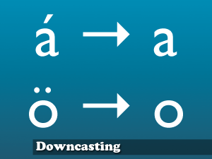
18:04 Another thing that we have been looking into is something called downcasting. I have no idea if this is a real word, but I made it up, so I'm going to go with it. And this is the idea that we take alot of accented characters and move them down into regular ASCII range. Most of the time, no one really cares, obviously, living in Iceland this does make a very big difference.
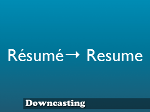
18:28 So we want to take things like Resume, and if you search for that you should be able to get search results for either or. So if you search for resume with the accents, the search results will find things with and without.
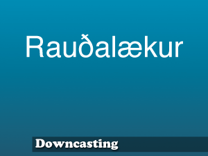
18:41 Now this is the street that I live on. As you can plainly tell there are two non-ASCII characters.
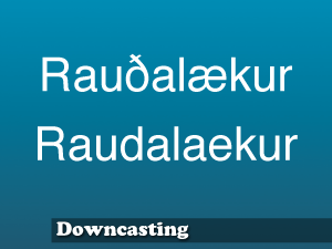
18:49 So most of the time I end-up typing it in like this or telling friends and family, if you are going to write me a letter just put that on there it's not a problem. But there is a website where you can do mapping directions. So if I want to give a friend, Here's how to get to my house. Here's my address, type this into the map and it will give you a little thumbtack. The problem is that if you type the second line, it says "We're sorry, no houses by that description". On a desktop machine it is not that bad to type the top line, but on a mobile device-up until the most recent version of the iPhone software, you couldn't physically type the ð or þ. It just wasn't possible. So there was no way for me to even use that mapping website if it didn't accept the second line. This goes for other devices you might have imported. I've got a phone from the US, it is localized for English. It's not going to have Icelandic characters in it, if your customer base is tourists coming to Iceland and they need to look-up street names. They might type in the bottom one and the map is just going to say, "I don't know where that is". So they have lost me as a customer because I can't, on my phone, send the link around to my friends about how to get to my house.
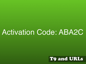
20:07 This is another one, it is an activation code. Maybe your service sends out tokens or short little activation codes. This is a typical activation code, ABA2C. Seems pretty standard, but then you start picking it apart. The A would be one press on the number 2 button, then you've got to wait a sec. Then you have to press it twice to get a B, then you've got to wait a sec again. Then you press it again to get the letter A, then you've got to wait. Then you've got to press it four times to get the number 2, then wait. Then press it three more times to get the letter C. That is 11 presses just to get that little 5 letter activation code.
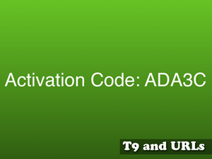
20:46 Wouldn't it be a lot easier if we could generate activation codes that look like this: ADA3C. So every time you are switching between keys on the phone. Now somebody on a QWERTY keyboard it's not any harder or easier to type in the first one, ABA or the second one ADA, but someone on a mobile device, if you're possibly in that urgent now category, this could be quite a lot of time saving. And really the end-user doesn't know the difference. Any good technology, the end-user isn't even aware of it. Both with the downcasting and these sorts of activation codes, it is a real step to helping your users without them even knowing they needed help. But this doesn't go for just activation codes. I would love to see this in tinyURL, so when you take a big long URL and make it into a tinyURL and send that to your friends so they can type it into their phone it saves a lot of time. I'd love for these to be T9 sort of safe strings, that way you never have to press the same button twice in a row.
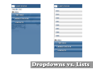
21:50 Another thing we have looked into is drop-down lists versus HTML lists. The first time we coded this up, it would be all the flight numbers. We did it as a quick drop-down list. And that makes the most sense, "OK, it is a small screen, we need to save screen real-estate, we'll make it a drop-down". Then we thought for a little bit. To get to that drop-down menu you have to tab to the drop-down menu, then push the button to activate it, then tab down to the item you want, push the button again to close the menu. Tab to the view button and push it another time. Or, with the longer list, you simply tab to the item you want and you hit the button. The drop-down list, even though it is shorter on the page, actually has 2 or 3 more clicks that you need to get through to actually get to the information you wanted. So we actually settled on the slightly uglier but faster list. There certainly are pros and cons, the flight numbers all start with the same letter, the drop-down list allows you to jump down the list, if you are in the UK, you can press 'U' and get down to the bottom of the list-that didn't really help us. As well, the nice thing about the drop-down list is that you can tab past it, so it if something very high in the page or very low in the page, it is going to depend on your needs and potentially on your customers as well, but because we were going for the Urgent Now, we decided that actually saving 2 or 3 clicks was more important than screen real-estate.
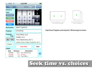
23:21 This is another one, it's a bit small, but 37signals had a really interesting article about this iPhone app. As you can see, it looks pretty bad, like somebody just threw-up on the screen. But their argument was that it was really well designed, it may look bad, and I'll agree that maybe the colours aren't the best in the world. It basically breaks down to seek time vs. choices. Things you learn in school about how we can remember 5 +/-2 things. That is why ATMs are very much asking "Do you want to take out money? YES, how much do you want to take out?" and you are drilling down and they are only giving you 4-5 choices at a time. Where this application gives you all the possible choices in the world at the same time. I think we are very much used to the windows software where you load it up, and asks "what would you like to do, would you like to start a letter? Yeah, I'd like to start a letter." Or you open-up iPhone and it says "here's how to import your pictures". A lot of applications that we are used to hold our hand and walk us through things. But with this guy, this is a travel calculator. So if you do a lot of travel or trips, and you need to deduct it for petrol or your milage on the car, people wanted to get in, say "I drove this many kilometer", save and get out. This is very much for a power-user. Not so much Urgent Now, but I want to get in, I want to get out, I'm logging time and that's it. So rather than being a really happy and helpful walking you down this path. It just puts everything on the screen and figures, he's and expert user, he'll hit the buttons he wants and get in and get out. So again, there is no magic silver bullet to the information you guys have for your clients and customers, when you think about it maybe your customer base is power-users, maybe if you are using it internally for an intranet or you are sending your people out into the field, you don't need this really nice, well designed-it needs to be well designed, but there is no flow, it just exists.
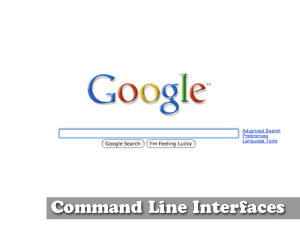
25:33 This is an idea that we have been kicking around for quite many years now, but I offer this up just as an example, I'm not necessarily going to say this is the way things are going to go forward, but someone was telling me the stats for QWERTY keyboards have gone from 4% to 11% in the last year, so the number of devices that can actually do A-Z text input is quite high, quite easy now and getting easier. So we designed an intranet a few years ago and we had taken our traditional intranet and just made a mobile version. So we figured if you wanted to get to look-up the phone number for someone like Síminn, you'd have to click, on our intranet we had 'clients'. On your mobile device, you'd scroll down to clients, and click on clients. Then clients would say, "Is it Vendor, is it a Staff person or is it some sort of client." So you'd scroll down to vendor, and click on Vendor. Then it would give you an A-Z list of all, so you'd scroll down to S and click on S. Then it would give you a list of all your clients that begin with S, you'd scroll down to Síminn, push the button. Then you'd finally get to the page which describes your vendor, the address, phone number and all the information about them. So I think that was what, 4 or 5 clicks? 4 or 5 times the page needed to load, 4-5 times it need to go get information. On a mobile device this could take quite a lot of time. So maybe the future is just command line interfaces? Maybe your mobile website, your fat-free website is just a box. You just type in the name of the client, search and away you go. If you think about it, google mail has done this. They say, "We don't sort, we search". I don't know if this is the future, but potentially it is the way things could go.
27:33 So I think we've moved from the types of users and the types of websites, now we've moved through the kind of things you can do to improve your website and things that you could apply to your existing website you might have. Now I want to talk a little bit about using the data that you have to its fullest advantage.
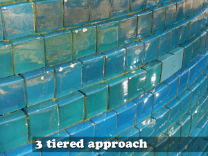
27:52 One of the things that we really like is this 3 tiered approach. Apple does a really good job of this, so we figured, steal their idea it's pretty good. If you think about your iTunes, the iTunes store, the iTunes application and your iPod. Those are the kind of three tiers that Apple works in. Their first tier is the iTunes store. In the store, in the cloud, we've got all possible songs, and all possible applications, and all sorts of stuff there. The second tier would be your desktop machine. On the desktop you've got iTunes application. This is where you can access the cloud. You access the cloud and pull information down and then on your second tier, in iTunes is where you do your searching and your sorting. So you build your play lists, and you rate songs and you do all that at a very personal level. Then your third tier is your iPod. So you move the information from the cloud to your desktop, you add more information and you put them in playlists on your desktop. Then you move it to your iPod. The iPod, up until recently, has pretty much been a read only device. Once you put the information in there, it just exists. You have to sync it again to get more info. We thought to ourselves, this is a pretty good model. Can we start to apply this to mobile web design, mobile sites and make a better fat-free version? So we've done some mock-ups, and one of the concepts was for a bank. We said, "what does a bank have?". Their equivalent of the cloud would be all sorts of stocks and currencies and all sorts of stuff and that's all out there. Then the equivalent of the iTunes would be something more like the website. We would allow people to go to the website and create custom playlists of stocks. So maybe you'd watch the stocks that you have or maybe watch the currencies that you want, those sorts of information. It would be very customized to your preferences. Then we would generate either a QR Code a 2 Dimensional barcode or a one of those activation codes that I'd showed you earlier. Of course it would be the fancy kind where you didn't have to push the button twice. And we would give that to the end-user, to the customer. And say, "Now on your mobile device, go to our website, just type in that 5 digit code and you'll get a customized version of the information that you want". It is read-only, but it would be equivalent to the iPod. Now your phone has the playlists of the stocks and the currencies that you want to watch. Now you don't have to weed through lots and lots of other stuff. It was also handy to generate the short codes, because then you didn't have to mess around with user-names and passwords and setting-up a whole nother thing. The little short code defined the information for you. So it allowed us to have a lot of short-cuts. We never ended-up doing anything with it, but we really like this 3 tiered idea and it is something that you might be able to look at in your own company and say, "Well, we've got this kind of data in these silos and we've got a lot of it, maybe we can augment it with even more information from the web, but then on a mobile device there is a lot of stuff coming at you." So you can use that middle-tier your own website to allow users to pair it down and change it and cut back the information to what they want.
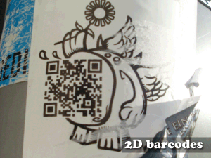
31:13 So I mentioned a little bit about 2D barcodes. I want to go into this a little bit. I find these personally very interesting, I really hope they take-off a bit more. Before we can talk about 2D barcodes...
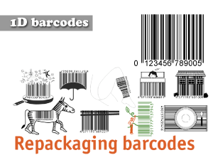
31:28 ... I want to talk about 1D barcodes. They're called 1 dimensional barcodes, 1D is 1 dimensional, because it is only read in one direction. So the information is purely horizontal - left to right. You scan it. It doesn't really matter how tall it is. So that is why you can do crazy little art work stuff with it.
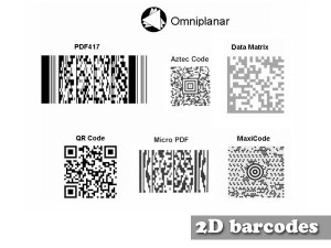
31:48 2 Dimensional barcodes can be read in 2 dimensions. Both left and right and up and down. In doing so we can encode, I think, up to about 4000 characters of information into that little square. You can see them a lot more places than you realize. A lot of products will have them. As things are going along the assembly line, they can just beam that and get the information back. Previous 1D barcodes pretty much only encoded ISBN numbers, 10 to 13 digits. These can encode up to 4000. So you can encode all sorts of stuff, plain-text, but most interestingly they've been used to encode URLs and it seems a bit silly, but it's actually quite interesting. How hard is it to type a URL into your phone? Then someone told me, "Well, Nokia is a big proponent of these and in Helsinki where it's maybe -20 and you're waiting at the bus stop, you don't want to take off your mittens to try and type in a URL." You simply hold your phone up, it takes a picture and gets the information you need.
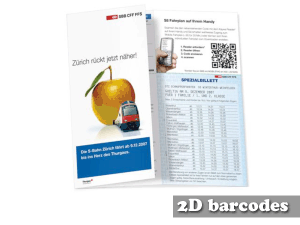
32:54 So the swiss are quite big on this. They've started to introduce these into their train times. This is interesting because the train time table has the times the train is suppose to run, but maybe in switzerland they run on time, but most place they've always got some sort of hiccup. So the URL up in the corner allows people to take a picture of that and get the current time the trains are running. Big picture: you can imagine for Iceland airwaves if there were posters around town and at the bottom of the poster it had a little QR code and instead of going to midi.is and this huge long URL to buy the ticket, they just click on the thing, it takes them to the webpage. No one had to type in anything and you buy and you're off and running. In Japan they have been experimenting with encoding binary data. So when you're on that band poster you take a little picture of it and you can get a 10 second preview of the mp3 of what the band sounds like. You could even go so far as to download it to your calendar so it saves it in your phone so it can block of those dates so you know when the event is.
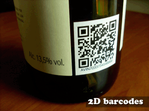
33:59 Other interesting applications, people are starting to tag physical objects. This is a bottle of wine. You can start to think of these things as hyperlinks for physical objects. You might buy this bottle of wine and you might see it in a store. You can take your phone and take a picture of that barcode. It will take you to the webpage and maybe it will give you average price, maybe it will give you reviews, how many other people have drank this bottle of wine, they think it's 4 our of 5 stars. Maybe it tells you what it goes well with. This bottle of red wine goes well with beef, something like that. Again, we can begin to pull in a lot of the social aspects we've heard throughout this whole conference. Taking physical objects into the same realm we do the web and this is all done through the mobile phone.
34:55 So I've kinda walked you through now, the types of users, the types of websites, some of the things you can use to improve it, how you can now use your own data and how to think about your website and the information you have. Now I want to start summing-up some of these ideas and how we've done some of our development.
35:14 I'm going to go through some of our best practices that we've kind of gone through and hopefully help other people and get some feedback and improve on things.
35:25 A lot of people recommend selecting a core set of phones. This has been talked about a lot and I'd like to reiterate this, because it is handy to have three or four phones in house. You want one from each type of vendor. One Nokia, one Sony Ericsson, one LG, one Motorola those type of things. As Nate was saying, it is going to depend quite a lot on carrier and all sorts of stuff, but this gives you a quick benchmark it is a good first look. If you're going to do a lot of mobile development have something in house, code something up and you can check it pretty quick. Sometimes we've done work on Blackberries a lot of people have iPhones and iPod touches so we test on those as well. You can get your code set of phones and then beyond that, you can usually grab people in the hall way and have them take a look at that. Usually, if you've got a brand new Nokia, the phones, plus or minus a few around them will have the same browser, same style, so if you test on one, it clears-up a lot of the core stuff, not the edge-cases, but alot of the code stuff to get you on your way. The thing we do after that then...

36:46 ... we keep testing. We end-up also, we build HTML pages which we test a lot of the ... does it support background images, does it support colour, and we have these on hand, so when we get a new phone or new device, we can quickly just visit that webpage and see the capabilities. Does the Blackberry support CSS, does it does this? Now beyond this, there is a service called device anywhere, and we've used this successfully in the past. You can sign-up for free and get like 3 free hours. This allows you to do tests on hundreds of phones. I think it's a data service in the UK and they've just got literally all the possible phones available and you pay by the hour, normally, and it allows you to see what is going on, on that phone. So you can actually pic edge-case phones or maybe you want to look at what's the hot free phone that vodafone's giving away if you sign-up for a 1 year contract. It might not be a great phone, but a lot of people are going to be using it just because it was free. So you want to test on those type of things and if you don't have one in house, someone like device anywhere allows you to quickly get up to speed and test those edge-cases. So it is good to have the core set of phones in house and get things working and then you can use device anywhere to test those edge-cases and that way you are not wasting and you are minimizing your time that you have pay on these other things.
38:10 So I guess in conclusion, developing for the mobile web isn't easy. All I can say is test, test and keep testing. It doesn't have to be expensive, you don't have to do user-testing, you can grab people in the hall way. Like I said, we're all consumers, we're all users. So if it feels wrong for you, it probably feels wrong for others as well. It is also good to bring people in from outside your project, because you might be looking at the same thing day in and day out, you know what it should do, but if you bring in someone who's never seen it before they can get a fresh pair of eyes and a fresh perspective.
Downloads
- Download Slides [iceweb.pdf (9.61 MB)]
- Download Video [briansuda-iceweb.mp4 (83.4 MB)]
Last modified: October 11, 2009 11:10:24 UTC
Copyright 2002-©-2025 Brian Sudahttp://suda.co.uk/publications/IceWeb08/transcript/