
<head> conference Transcript
10:18 Alright well, thanks everyone for coming out, thanks for inviting me Aral. Today I am going to talking a little bit about creating a specialized mobile UI, so if you are in the wrong room, this is your last chance to leave. This is something that we've been working quite a lot with at work. So wanted to kinda put all my ideas, pen to paper and came up with this presentations. Now, a little bit of background about me, my name is Brian Suda. I am trained more in the programming world, so my background is in Java, C++, that sort of thing, a bit of project management, but at my current job, everyone ends-up wears quite a lot of different hats. So somedays I am programing, somedays I might be bug fixing, somedays doing little CSS tweaks, somedays user-testing, I'm sure it is quite similar everybody else listening as well. Somedays I am the official designer in the office, which I find quite funny, somedays I work on UI stuff, and I'm not a UI expert, so a lot of this stuff isn't from an academic background, its more of a practical stuff. I think, ultimately, were all consumer, were all customers and we know when we see bad UI, we don't nesscarily know how to fix it. So hopefully, today I'm going to run through a few things and give you some ideas, now none of the is going to be a silver bullet. Depending on your customers, your information, your data, your going to have to adjust this accordingly. But Hopefully, you'll get some ideas you can take away and bring back to your companies or your next project.
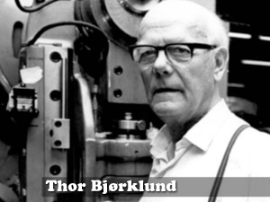
12:09 So first I want to to talk a little about this guy, this is Thor Bjørklund, and he is Norwegian and lived, I think, late 1800s to 1920s and he was a master carpenter and I'm will tell you this little story because he did some interesting things. Now, you cam imagine every day, he'd go to work, his wife would pack him his lunch, and noon would come around. He'd go out, open his little tin box and he have a couple slices of bread and a block of cheese, just like every good Norwegian, they love their cheese. And he would take out his little pocket knife and try an slice the cheese. And sometimes you get good thick slices, sometime little thin, sometimes it cuts off and it chunks and it crumbles and doesn't work so well. So being a carpenter he looked around his office and said, "Well, everyday I've got this wood planer. I smooth wood with this device, and it cuts off nice crisp little sheets. What if we could make something similar for cheese, so I could slice off nice thin slices of cheese every time, consistently." And low-and-behold he invented the cheese slicer! and this was a great revolution, this was truly cheese slide 101, cheese slicing 2.0! The reason I tell you this little story is because he had an interesting insight. Instead of trying to force the pocket knife into doing something it couldn't he decided to scrap that and come-up with a whole new tool. And i am going to demonstrate through some history all sorts of times that his has come in handy. So instead of trying to adapt the previous paradigm, we are going to drop that and come-up with a new one.

14:09 So I'm want to talk a little bit about Television. In the 1920s-1930s the US started broadcasting television first time, they have been doing radio for about ten years previous. When the first TV shows came around, they didn't know exactly what to do. So they would take their previous knowledge, radio, plop two people at a desk and put a microphone in front of them and they would talk, but this time they would point a camera at them. So we call this just "talking heads", it's not very interesting television, you end up just seeing people talk to each other. But way back when, when they were first describing television. What they did is they say, "It's just like radio, but with pictures." and this is good because it grounds people knowledge. They understand radio, they've understood radio for ten years. So to say that TV is radio with pictures, people could understand this. We saw this again with the Internet. The internet was always claimed to be TV but more interactive. And ironically, now with digital television, with the red button and the choices, they are billing televisions as more like the internet. So we can see that throughout all these times, we have taken the the previous paradigm, radio, and try to describe the next paradigm, television, in the same sort of framework. This is good because it helps people understand. They know the previous paradigm was, so they know what to expect from the new one. The downside to this is that it ends-up framing the conversation. We all know that TV is so much more than radio with pictures. And we all know that the Internet is a lot more than TV but more interactive. So it really kinda bugs me when people say "the mobile web is just like the regular web, only on your phone." And if we take a look at all these previous paradigms, we know that the outcome is always much, much greater than the previous. So to say that the mobile web, is the web on your phone, I think it is doing it quite a bit of injustice. So I think, hopefully today I will show you and demonstrate that the mobile web can be quite a lot more than just the internet on your phone.

16:34 That another thing I want to talk about, another gripe. The term mobile web, because it's about the lifestyle, and I think that by continuing to use the term mobile web, we are confusing it and not really helping the situation. Because I think a lot people when they hear mobile web, they are thinking about it as more mobile as a noun. So when we say mobile, they think about the device, so the mobile web isn't the web on a mobile phone. It should be mobile as in an adjective should be about their lifestyle, it should be the mobile web it should be the web on the move. And the reason for this is because I might be sitting at home and at home I've got wifi and a very fast connection. So if I am siting there with my little [iPhone] or iPod touch, I am happy to surf the BBC's regular website. I've got a fast connection so I don't care if the homepage weighs in at 200 or 500 kilobyte, I am just sitting there watching TV, I'm not very mobile. But I am checking this on what people would consider a mobile device, so by saying mobile web, you are almost saying you can't check regular web pages on a mobile device if you consider mobile a noun, conversely I might be at work, and getting customer service calls, and rather than use the traditional desktop website I'll use the mobile website, because it's faster, it's smaller and get the answer to the customer a lot faster. But that wouldn't make a lot of sense either, using a mobile site, mobile for device, on a regular computer, So I think by continuing to use the words "mobile web" we will never break out of this paradigm. So if there is one thing that everyone takes way from this presentation today, is that we should stop using the words "mobile web". I don't want to hear that anymore, but it's difficult to tell you to stop without offering an alternative. So I want to show you what we talk about at work.
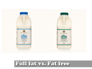
18:53We talk about Full fat vs Fat free. So instead of talking about a desktop website or traditional website versus as a mobile website, we've kinda framed it as full fat and fat free. This has several advantages. Everyone kinda knows what fat free means, sometime we use the words sugar free as well. The fat free website, we've always kinda taken the opinion that a mobile website should be very lean, should have just the information you need, because people might be in a crunch, their checking your mobile website because they need the information. This could be things like your siting in a cafe and you've got five minute to spare, you might be running between airport terminals. So you don't necessarily want to be checking out the full fat website, but I said earlier, if your sitting on your couch you don't really care. The other nice advantage of calling it fat free or sugar free, it that it helps to limit feature creep. With a mobile website someone says, "Oh, Let's just add another navigation item here. we need to add company history". Well if you just call it mobile website, sure it fits in your mobile navigation, but if you call it a fat free website, every last little new bit has to really fight to get in there. Because by adding company history or board of directors, you can say to the people "Is this site still fat free?" and they'll say, "Well no, not really", well then it doesn't go in the fat free website it goes in the full fat website. I'm sure depending on your customer or the data you have for you company, you'll kinda see, no one really cares about the board of directors as you're waiting for a bus or on your morning commute, they are after some other information.
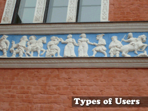
20:56 So that really bring us to the types of users. Now google did some did some really interesting stuff a couple of years ago, or last year. So we can stand on the shoulders of giants and just reuse what they've done. They analyzed their whole customer base and realized that their users broke down into one of three categories. These categories were Repetitive Now, Bored Now and Urgent Now and depending on your customers or your company you'll identify one or more of these groups as your potential users.
21:35 So the first group was call repetitive now. This is the sort of people who will visit your websites, look for a tiny bit of information and go away. This could be things like: stock quotes, weather, or some sort of other information, little tidbit. So when you are designing your fat free site, you don't want to bury this information two, three, four hierarchical levels deep. You are not converting them for page views, your are not trying to get them for their session times to be 5-6-10 minutes. These people have one task, to get in, find the information and get out. So you are not going to covert them in any way. If this is the type of information you have you want to design to this strength and realize it is going to allow for very quick access.
22:31 The second type is bored now. These are people who, again, might be waiting for the bus, waiting for the tube and they've got 5 or 10 minutes to kill. This could be, that you've sat down and ordered coffee and you're waiting for a friend. So you've got a few minutes and you don't really know what to do. You just want to be entertained. Google has done a really good job with YouTube. Here are a couple of videos people are watching now, here are the the top 10 videos on the site, people aren't really looking to search or dig down, they just want to be entertained and if this of data that your company has, you also want to potentially play to this strength and to the Bored Now and just offer some suggestions on your mobile site.
23:24 The last category is Urgent Now. This is information that is critical. People need it, and they need it now. This could be things like: your flight was running late, and you've landed and you want to see if your going to make your connecting flight. You want to just login to the airlines fat free version, say "Yes, I've got 10 minutes" or "No, I've already missed my flight". These are thing potentially like, if maybe the electricity gone out in your house, or the water main outside explodes and the street is flooded. You don't want to dig around and go to the city's website or the water company's website and have to dig down 4 or 5 levels, the phone might be the only device you can use to get one the internet if the power is out. So you want to be able to get in, get a phone number, call and be done. You don't care about the other stuff. We did work for an airlines and we realized that their potential, fat free mobile customers would either fall into the repetitive now, they're checking to see if their friend has landed. Has the flight landed yet? No. Has the flight landed now? No. So they keep checking. They are just checking for one little tidbit of information. They might be checking every ten minutes. The other category we identified was the Urgent Now. Like I say, Am I going to miss my flight? Has it already taken off?
25:06 So we've identified the different categories of users, we've identified the types of website we want to build. Now I am going to try and take you some of the more practical items that you can actually apply both client-side and server-side.
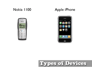
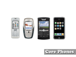
25:27 So if you thought developing for the web was hard, you had to worry about Internet Explorer, Safari, Firefox and various versions, you've not seen anything yet. The web ranges the simple green screen type Nokia type phone you see here, all the way up to the quite feature riched iPhone. But it's not just about screen size, resolution or connectability, we've also got to take into consideration things like the Nokia only has a simple touch page, with T9 type entry. Where the Apple iPhone keyboard is virtual so you can do QWERTY keyboards, you can localize the keyboards, you can have custom sort of input, it doesn't really matter. Now, by the end of 2008 Apple is expecting to ship around 14 million iPhones. That sounds like quite a lot, but in fact...
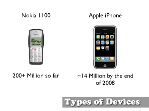
26:28 The Nokia 1100 has already shipped over 200 Million. Now, that means for every 1 iPhone out there, there's 11 or so of these very simple Nokia green screen phone. So I think as we develop for your Fat free website, we need to take into consideration this whole range of devices.
26:53 So the best way we can do this is Browser Sniffing. Now, I realize that a lot of people don't recommend this, but there are certainly pros and cons to Browser Sniffing. What browser sniffing is, sometimes called User-Agent detection, this is, you are detecting the type of site or type of device and you are serving up a specific site for that device. Now, we all probably realize that there's over 1000 something phones produced every year. So if you are going to browser sniff for every single one of those means that you've got 1 traditional website and 1000 plus fat free websites and the maintenance for that just becomes ridiculous. Most of use have probably encountered Browser Sniffing when we maybe use our bank's website. So, you go to your bank's website and we try to login and it says, "We're sorry we don't support that browser, please download Firefox 2 or greater". And you kinda scratch your head and say, actually I'm running Firefox 3 beta, that's greater than 2. Most of the time browser sniffing is done pretty poorly and it is used in a preventative measure. So, It checks your browser and then prevents you from doing something. And thins kinda goes back to the idea of graceful degradation versus progressive enhancement. Now, I come from more of a programming background so we learned quite a lot about graceful degradation. And what this means that you build your website, you build your code and it degrades gracefully, so if you're on a slower connections, it's still OK, if you don't have javascript it's OK, if you don't have CSS it degrades gracefully. The problem with graceful degradation, is that generally you do your fancy, fancy website, then you start to go back and do some of this graceful degradation and the budget is run out, or the deadline has come and gone and a lot of this stuff gets push away to the side and we'll do it later. But the better way to think about things is progressive enhancement. So you build a very base-line website which works for everybody and then you slowly layer enhancements on top of this. And some of these enhancements can be done through browser sniffing. So the idea, what we kinda of advocate is you build your base-line site, so you only have one fat free website, just like you have only one full fat website. Then depending on the device, you start to add a little bit of sugar on top, you add a little but of extras. And it may not be easy, and you're gone have some win-some, lose-some, but from the customer's point of view you end up getting quite a lot of benefit and they'll really thank you for these little tweaks. So what are some of the things, once you can sniff the browser that you can server-up? Well, if we detect the device we know the potential width and height and can server-up different types of images. We can tell if the device even supports JPEGs or GIFs, and if they do we can send those, if not we might be able to fall back to more simpler BMP type formats. Also, we can if the device supports Javascript or if it even supports CSS at all. Depending on all this, we can serve-up or customize and tweak the HTML a little better.
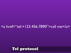
30:34 Some of the other things we can detect is the TEL protocol. This is an interesting one, because much like the mailto link, when you click on a mailto it launches the mail application. The tel protocol, the tel link, when you click on a link it will launch the phone's dialing program. This is also a pet peeve of mine as well, some content admin systems have a little check box that says "make a mobile version of this site". And that way it outputs, it takes the HTML that you created for your traditional website full fat website and creates a mobile ready version as well. Again, this is one of those reasons that I would argue you need a separate type of site, because it is a separate type of interaction. On a lot of contact pages, you will have a form that says, please type in your name, select from this drop down your type of issue, please type in the information you want to send to us, etc. That works well on a desktop, full fat website, because you are sitting in front of a computer, you've got a keyboard and you can type your message. But as we saw with that poor little Nokia, data entry on that, and I'm sure on most phones you may have as well, is not easy, it's not fun. Going Back to the airlines example, if you just landed and you've lost your luggage or your luggage didn't get to the right place, you might want to check the mobile website (though we lost audio) you don't want to go the fat free website and be confronted with this faceless form. You are probably pretty mad as it is, you don't want to sit there and type in a message and press the send and it disappears into the ether. What we decided to do is put the phone number for the customer relations website. And i think this is good because your phone, the best thing it can do, it's optimized to make phone calls. So why not play to its strength and start using some of this this tel protocol. So people can actually call, if you've lost your luggage and talk to a real person and hopefully it will calm the situation down. I think this is one of those simple little tweaks that really make a big difference for your customer base.
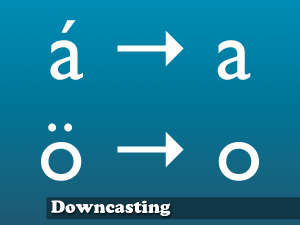
32:16 Another thing that we've tried to do is something called Downcasting. I'm not actually sure this is a real word, but this is what we call it. And this is when we start to take the accents off of characters. So the a with the accent is equivalent to a regular a, the o with umlauts is equivalent to a regular o.
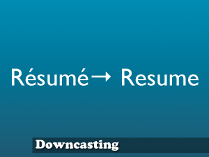
33:37 This is important because if someone types the word resume, we want to be able to fine search results for both the word with the accents and the word without. This is something you'll do more on the back-end in the database.
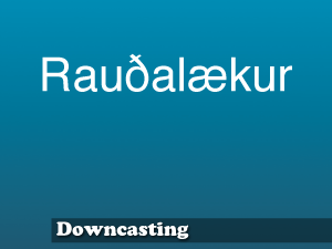
33:53 This is important, because this is the name of the street that I live on and as you can see there are probably two characters in there that you can identify that are not in the ASCII range. It's the Ð character, the d with the little line through it, and the A-E kinda squished together.
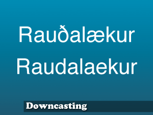
34:13 When I go to websites, I generally type this in as the name of my street. There's a map website were you can look-up street addresses. So, on my phone I would always type in the second word. And it would say, "Sorry, no streets found", so I'd it try again, and it would say "Sorry, no streets found." Even on the Apple iPhone, up until the most recent 2.1 firmware release, there was no physical way for me to even type that Ð character, the D with the line through it, it was impossible, and depending on other devices that people might have, it might be localize to different languages, or the input characters are just not an option. So if you don't downcast your characters and allow for smarter on the back-end, you're turning customers away. I mean, I quit using that address map look-up service, because it didn't know where my house was. I couldn't send a link to friends and expect them to be able to find my house. So, as with any good technology it should disappear into the background, the end user shouldn't know if you do downacasting or not. But when they type in that second word, they should still get search results and they should be happy. By not doing downcasting you are limiting your customer base and potentially turning a lot of people away.
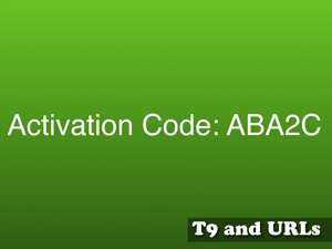
35:44 This is another one, this is activation codes. The activation code here, ABA2C something you might see, everyone sees. We've all gotten something like this. The problem is, to type the letter A you have to press the number 2, on a T9. Then B you'd have to wait a sec, push it twice, then wait a sec, then push it again to get another A. Then wait a sec. Push it a couple of times to get the 2, then wait again, then push a couple times to get the letter C. To type in those 5 characters, you have to push the number 2 button, I think, 11 times. Which is quite annoying, wouldn't it be better if you activation code just looked like this:
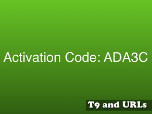
36:25 ADA3C, now at least you are switching between the number 2 key and the number 3 key, so it speeds-up data input. Now, there is no difference really between ABA and ADA. So, if you are on a regular keyboard you, QWERTY keyboard, you don't see the difference, it doesn't effect you. But if you are on the old T9 number pad, it is actually quite a lot easier. And again, I started to write some code to generate T9 safe strings, but I never got around to finishing it, just because I'm lazy, but if someone else wants to finish it I'd be quite happy. You don't have to use it for just activation codes. I'd love this feature in tinyURL. So you create a tinyURL and "make my URL mobile safe". That way you can send it around and people don't have to push the button several times. You could go as far as your product ID could be this way. Again, it is one of these things that the customer will never actually know that they've got a T9 safe, they'll always get them. A good technology shouldn't even be visible to the end user.
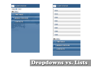
37:50 Another thing, is we came across, Drop downs versus Lists. The one on the Left that uses the Drop down. That was our first mock-up. We said, OK, we've got a list of all the fight numbers that we want to check flight status for. Screen real estate is pretty tight on a phone so let's make it as a drop down list. Then we thought, well let's mock it up as a simple <ul> HTML list and that is the design on the right. Now the design on the right is a lot longer, but it is actually more efficient. The drop down down menu, you'd have to tab to the menu, then push a button to activate the menu. Then you'd have tab down to the item you wanted. Push the button to close the drop down menu. Then tab over to the "view" button. Then push the button to view that flight number. Whereas, if it's just a long ugly list, you simply tab down to the item you want, press the button. With the drop down, I think, we figured there is actually 2 or 3 more clicks to get to the same sort of information and if you customer base is on the Urgent Now, this could make a big difference, these extra 2 and 3 clicks. So we decided to settle for the HTML list, the slightly longer uglier list, it was more efficient. Now there is certainly pros and cons, depending on your information that might be different. The nice thing about the drop down list is that you can tab past it, you can just outright skip it. Also, maybe your drop down list, all of our flight numbers started with the same letter, so there was no way to skip down the drop down list. If you are doing country names, you can skip down to 'M' or down to 'U' quite a lot quicker than you can in an HTML list. So there's certainly pros and cons, depending on your data, it is something to consider. It's just that I am highlighting this because really we thought, "Ah, drop down lists", but in actuality the HTML list was better. So it is something to think about.
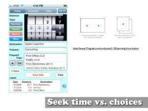
40:14 I'm going to talk a little but about seek time versus choice. I don't know, it is a little small, but there is a link there to a 37 signals posts. Where they talk about this is an iPhone app for tracking you mileage. Depending on your company, you could get reimbursed for your mileage. A lot of people really complained about the UI on this. And the 37signals kinda broke it down and said well actually it's pretty good design. Now I'll agree that it might not be the best colors, it looks a bit like some one just threw-up on the screen. But it is actually quite efficient, and when they broke it down it started to make sense. You're probably all used to things like the ATM. Where you go to the ATM and you see 4 or 5 choices and this goes to the 5 plus or minus 2. So you'll say I want to withdraw, then it takes you to another screen then it asks you how much do you want to withdraw and they give you 4-5 more choices there. So it is very much a depth versus breadth item. You're drilling down and drilling down. Whereas this application has decided to put everything on the same screen. In doing so, it looks pretty ugly, but is actually very efficient. Someone can open it up, within 1 or 2 clicks log their time and be out. I bring this up because if your customer base is the Urgent Now, or maybe the Repetitive now, you want them to be drilling down quite deep you just want to get in and get out. I think a lot of us are probably use to Mac software of some of the Windows software which holds you but the hand a lot. Welcome to Word, here is where you can type, do you want to do this, blah blah blah blah, and you can do one thing at a time and it very much leads you down a path. Whereas this application throws everything in your face at the same time. So depending on your user-base if they are new users or if they power users your UI will be vastly different as well.
42:35 Finally, I want to talk a little about command line interfaces. This is something, it´s an interesting idea and I haven't see this used very often, so I'm not advocating command line interfaces, I just want to bring them up because it is something we might see in the future. Now I know we did a mobile website, we had taken an intranet and converted it into a fat free version. Say I wanted to get the phone number for our telephone company. So you click on contacts that brings-up a new page that says, view staff, view customers, view vendors. Then maybe you click on vendors. Then it gives you an A-Z list and you go T for telephone. You click on T. Then it gives you a list of all the companies that start with T and then you scroll down to Telephone company and click on that link. Then you finally get the profile page of your telephone company with the phone number you can actually then call them. So that was what 4, 5 levels deep to get to that phone number. With a command line interface maybe you see just a box and you type "vendor telephone" and it simply returns the contact information for you telephone company. As we see more devices with QWERTY type keyboards, this might actually be the fastest way to get to the information you need. Even Gmail has opted for search as opposed to sort, they have done away with all the hierarchy and gone for just searching. Maybe this is the future of fat free website, I'm not 100% sure, I'm not convinced yet. We've started to see this a little bit with IM bots. So things like, AOL has a Santa Claus bot and a weather bot, where you simple ask it free text questions and it response with an answer. Maybe not this year, maybe not next year, but maybe these sort of command line interface could be the future on mobile type devices.
44:52 So we've talked about types of user, some of the more practical things you can do. So I want to shift gears and talk more about the data that you have.
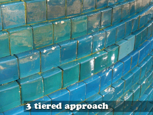
45:01 I am a really big advocate of this three tiered approach. Apple does a really good job of this. They have take their product and split it into three levels. You've got your iTunes music store, which everything is in the Cloud and all the information is there. Then the second tier is your iTunes desktop application. From your desktop you can access the cloud, pull down the songs, pull down everything there. On the desktop is where you organize it, you rate your songs, you put them into play lists, etc. Then the third tier becomes your iPod. Your iPod is generally a read-only device. So you move your information from the cloud to your desktop, from the desktop to your device. So this is a good three tiers, nice separation. So we thought, well, this would be an interesting idea for a mobile site as well. We did some work for a bank, we looked at the bank and said what are the three tiers? We've got our data in the cloud, which could be stocks currencies, all sorts of stuff. The desktop version, the equivalent of iTunes, would be the bank's website. Here you can create custom play lists move things around, I want maybe UK/British Pounds, Euros and US Dollars and create a currency play list, and then that would generate a specific website just for you. Which you can then look at on your mobile device. You've have created a read-only version of the website. So it is very cut down and just the information you need. So some of the ways we can create this custom site with potentially our activation code I showed earlier. So that person goes and types in a very short code and gets a custom page. Also we can generate 2D barcodes.
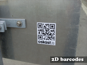
47:10 So what are 2D Barcodes? This is an example of one.
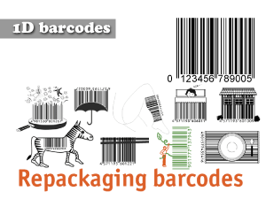
47:14 I think first, we need to talk a little bit about 1D barcodes. These are traditionally called 1D because they're only read in 1 direction, from left to right.
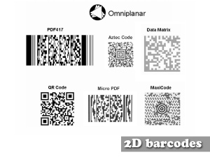
47:25 Whereas 2 dimensional barcodes are read left to right and vertically so we can add a lot more information in there. The previous 1D barcode would only showed the ISBN number. Where 2D barcodes can pull in, i think, something like 4000 characters. So it could be text, it could be an identification number or it also could also be a URL.
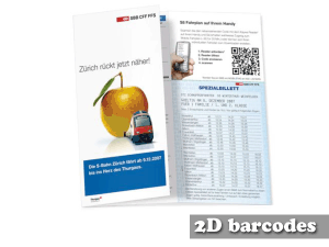
47:48 This is a time table for some trains in Switzerland. Obviously they've made the printed copy which gives you all the times the trains are running, but trains may be running late or early or canceled. So you can take a picture of the little barcode, the 2d barcode and it will convert to a URL which you can then view the fat free version of the train time website and see is the train running canceled is it running late, etc.
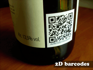
48:17 Another example, we can start tagging physical objects. So we can tag a bottle of wine, and then we can take a picture of this wine, you might be shopping, and it might take you to a website so the website could give you an average price, it could recommend if this goes well with beef, or fish, or chicken, it could also recommend of all the people who have drank this wine they give it 4 out of 5 stars.

48:43 This is some of the ways you can actually use the data that you have at your control. Maybe your company has several data silos, and you can begin to think about, can this information be used in a sort of three tiered manner, to generate a read-only, light-weight version, fat free version of your site to help optimize it for end-users.
49:10 So I am going to start wrapping-up a little but with some best practices. One of the things we do at our work is we've generated HTML files for ourselves. And these HTML files have lots of different tests, like they'll test CSS background colors, or CCS background images, we'll also have all sorts of little things, javascript, tables. Then we'll upload those to our server. So we've kind of created our own personal test-suite. Because that way, when a client comes to us and says we need to support this phone, we want a website. We can quickly run that phone through our series tests and know the limitations and know the shortcomings. Does it support the tel protocol, yes or no? and if it does we can use these sort of things in our project if not we can't.
50:04 We've also decided to settle on a core set of phones. A lot of people recommend picking up 4-5 phones. One from each of the major manufactures, one Nokia, one Sony Ericsson, one Motorola, etc, etc. Generally, the browser on one Nokia will be the same browser on the next, maybe slightly different versions. But this way, you have the phones in house and can do a couple quick round of testing and sort out a lot issues. We've then also then rented time on services like Device Anywhere, were you rent time on real phones. It's not expensive, but it's not cheap. By having a couple phones in house you can sort out a lot of problems then you can use services like device anywhere to get all your edge cases and sort out a lot of other things. Some of our clients use Blackberries, so we have tested on Blackberries and then a lot of people have iPod touches or iPhones so we generally have a peek at that because their available to take a look on.

51:15 So I guess in conclusion, there is no silver bullet. You always want to test, Test both your HTML and test usability. This can be as simple as grabbing someone in the hall and saying "hey, do you mind having a quick peek at this?" Because if you look at a website day after day, you've got your precognitive notions, getting another set of fresh eye on it really helps.
51:41 In conclusion there is no silver bullet and there is no one UI that going to solve all your problems. But hopefully, i have outlined several different types that depending on your information and your customer base, you can use and take away and help build better website.
Downloads
- Download Slides [mobileui.pdf (9.4 MB)]
- Download Video [headconference.mov (53.9 MB)]
Last modified: October 11, 2009 10:33:47 UTC
Copyright 2002-©-2026 Brian Sudahttp://suda.co.uk/publications/headconference/transcript/